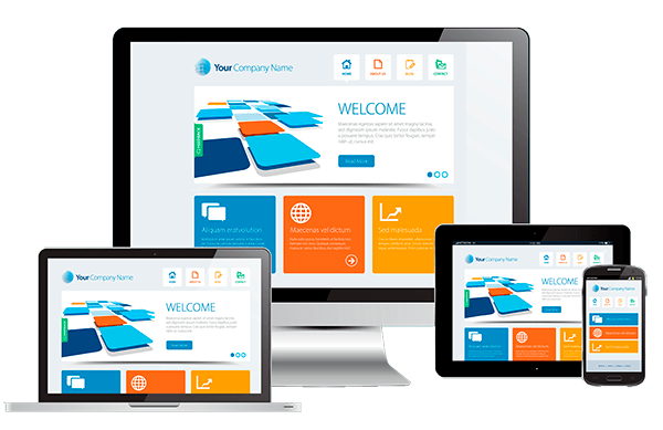
If you wake up in the morning and check a favourite website on your laptop, then check it again on your tablet, and again later in the day on your smartphone while waiting in line, then you’re like many people who access the internet from different web-enabled devices. Most people who own multiple devices eventually get into the habit of checking their email and favourite websites from all of them at some point – a practice that is largely possible due to responsive design.
When it comes to the mobile web, you’ll hear no shortage of experts touting the advantages of responsive design. This became especially true after Google recommended the technique in April of last year. There’s no doubt that it’s an effective way for to create websites that adapt to a variety of devices, but is responsive design for everyone and every website?
What Is Responsive Design?
The responsive design approach says that a website should respond to the user according the device, screen size, and orientation. As a result, websites created with the responsive design method are designed to display optimally at a range of sizes, no matter what device or screen resolution the user is using.
In a world where people frequently switch between a growing array of devices, responsive design allows webmasters to create “flexible” websites that adjust to fit the device and user. This is done through the use of flexible grid layouts, adaptive images, and CSS media queries. Flexible grid layouts use relative units – in essence, percentages – rather than fixed units, like pixels. Media queries analyze the device upon which a site is being displayed in order to figure out how best to display the website.
The Pros
- With responsive design, you only need one set of content for your site. As a result, you can save yourself the time and money you would otherwise spend creating entirely different sets of content for display on different devices.
- You don’t need additional websites. Creating and maintaining separate websites can be time consuming and costly – and even doing so isn’t likely to cover all of the different devices in use today. With one responsive design website, you only need to apply updates once and your visitors will see them – no matter what devices they’re viewing from.
- With one website, your traffic and SEO won’t become diluted across multiple URLs.
- With responsive design, you don’t have to worry about which devices will hit the market and/or become popular. Your website will be flexible enough to suit all platforms.
The Cons
- Not all website elements display well on all devices. For example, a video that displays well on a computer monitor may look tiny and indecipherable on a cell phone screen.
- Responsive design websites take users on the same user journey – despite the fact that users tend to behave differently on different devices. For example, an eCommerce site originally designed for the desktop gets converted into a mobile website for tablet sand mobile phones. However, research shows that people are more likely to use their mobile phones for research and do the actual buying on a desktop or laptop.
- Although a responsively designed website may adjust to fit a particular device, it may still load slower than a mobile-only website whose content has been stripped down for mobile-only use.
- Some browsers still support CSS2 instead of the newer CSS3 (the only CSS code version that supports the media queries used in responsive design).
- As with all new web design techniques, responsive design still has some bugs to work out. Results will vary from website to website, so it might take longer than expected to implement while you work out the kinks. For this reason, you could make a good case for adopting a hybrid approach of separate websites and responsive design.
Is It Right For You?
To decide whether or not responsive design is right for you, consider the objective of your website, as well as the amount of resources you’re willing or able to devote to maintaining it. Depending on how the chips fall, you might be better off investing in a separate solution for a different platform.
One such example is the LinkedIn app for iPad. Instead of simply adapting their desktop website to mobile, the company created an app that has more functionality on a mobile device than their normal site would. Similarly, you should weigh the cost of creating such a website against your anticipated functionality needs and potential ROI.
Also, if you do employ responsive design, keep in mind that creating one site for multiple environments will require lots of testing. Although your site’s concept may be simple enough, testing will let you hammer out the fine details of how to make your website display optimally for all devices. Use a service like Google Analytics to evaluate the performance of your website across different types of devices to be sure that all users receive the same experience.
Responsive design is a powerful tool for creating “layout agnostic websites.” However, it is only one tool in the web design and marketing tool chest. As time goes on, developers will no doubt find new ways of making this method even more effective and, consequently, websites will become even better at adapting to a variety of web-enabled devices. But until then, it’s best to carefully evaluate your mobile site design options and act according to your business’s best interests.